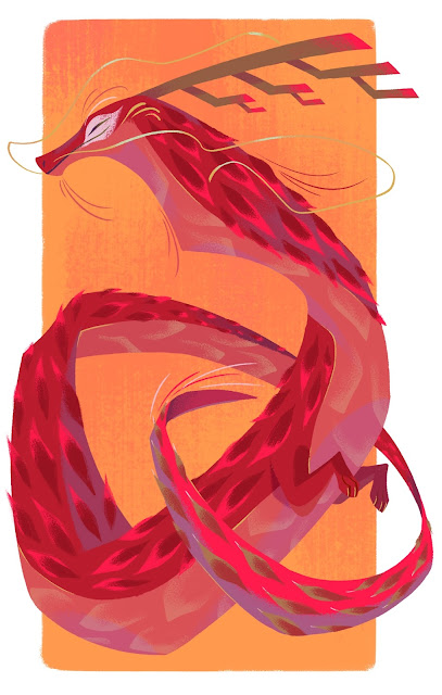
Describe your illustration style in ten words or less.
Graphic and illustrative; big shapes, small details and textures.
What items are an essential part of your creative space?
A pile of art books to browse for inspiration, a mug of tea, my planner/journal to jot down ideas/sketches and of course, my Cintiq (a drawing tablet).
Do you have a favourite artistic medium?
I mainly work digitally but traditionally, I love working with a watercolour + coloured pencil combo.
Name three artists whose work inspires you.
(Only 3?!) Mike Mignola - Creator of Hellboy. Need I say more? His style seems deceivingly simple but packs a real punch- the true definition of line economy.
For his ink work, he uses graphic, stylized shapes with relatively simple rendering but the way he blocks out shadows creates drama; it’s very evocative and moody, but can also be incredibly dynamic. His watercolour work is has a softer feel but still retains its graphic quality.
Camille Andre - I first stumbled across her animation production work and loved her design sensibility but then I discovered her watercolour/gouache work and became smitten. She has incredible control over the medium and uses textures and beautifully stylized shapes to create these incredibly appealing illustrations. I love the way she plays with hard and soft edges to create visual interest and keep your eyes dancing from one detail to the next.
Jon Klassen - My introduction to him was through his children’s books and I was drawn to them precisely because they didn’t look like your typical children’s book: the muted colour palettes, the stark shape language, the trademark stares. Even so, his illustrations still exude so much charm and playfulness. I especially appreciate his use of textures in his expressive strokes and watercolours.
Which artistic period would you most like to visit and why?
Baroque - It was less about the idealized and perfectionism of the Renaissance and more about contrast and drama. Artists were starting to bend the “rules” of how to portray the human experience, embracing darkness as well as light (literally and figuratively). Europe was also going through a lot of cultural shifts and there was a huge spread of ideas from all over the world.. definitely seems like an interesting period to visit!
Who or what inspired you to become an illustrator?
I fell in love with art at a very young age, obsessively drawing dinosaurs, magical creatures and characters. Growing up, I continued to draw and paint but due to my upbringing, I was never able to conceive it as anything more than just a hobby. My high-school animation teacher was the first person to challenge that idea by suggesting I pursue a career in animation. The way he so easily shattered this “imagined” barrier still astounds me actually, haha! Thank you for planting that seed, Mr. Magallanes!
Animation and illustration have similar design principles and often go hand in hand, so I found myself doing a bit of both. Moreover, animation production work requires a specific approach (because you are designing for movement) so I use Illustration as a way to create with a different part of my brain.
Can you share a photo of your creative work space or part of the area where you work most often? Talk us through it.
When setting up my desk area, I wanted to create a little zone for myself where I could feel surrounded by the myriad of artwork and styles that inspire and influence me. My brain is a little cluttered and there’s always a lot going on in there; I feel like my workspace reflects that a bit, haha! A lot of the toys and trinkets on my shelves have sentimental value and/or a story behind them, so they make the space feel more personal. I’m also proud to say a lot of things at my workstation are second hand / repurposed items.
When setting up my desk area, I wanted to create a little zone for myself where I could feel surrounded by the myriad of artwork and styles that inspire and influence me. My brain is a little cluttered and there’s always a lot going on in there; I feel like my workspace reflects that a bit, haha! A lot of the toys and trinkets on my shelves have sentimental value and/or a story behind them, so they make the space feel more personal. I’m also proud to say a lot of things at my workstation are second hand / repurposed items.
What is your favourite part of the illustration process?
The part after the thumbnails and sketches, just when you’re starting to lay down some semi-final lines. It’s so exciting to start seeing the semblance of the finished illustration!What advice would you give to an aspiring illustrator?
Being an artist can be a huge part of your identity, but I stress to younger artists not to place their self-worth on metrics, numbers, or the performance of others. Art is an extension of yourself, which makes it intrinsically valuable. That’s why it’s so important to really get to know yourself: what fills your cup, what conditions you work best under, your strengths and weakness, etc. Continue to find ways to grow, develop your voice and find joy in the process of creating.
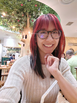
Tara Hân-Trần Johnson is a Vietnamese-American illustrator/animation designer at studios such as Disney Television Animation and Nickelodeon. Inspired by nature, anime, and all things cute/creepy, she loves playing with graphic shapes, interesting textures and unexpected colors.
For more information, please visit Tara's website or follow her on instagram.


.jpg)

